UPDATE 8/17/15
Today we released a new update for our iOS users that should fix the issues some of you have been having with the app. Scroll to the bottom of this post for a complete list of changes we made in this most recent version of the app.
Hey, Everyone!
You might have noticed something a little different about your SparkPeople Mobile app recently! Our goal for this most recent update was to make the app easier and more fun to use--and we think we achieved that!
If you haven’t seen it yet, we think you’ll love it; go check it out. You can download SparkPeople Mobile at the Apple App Store or the Google Play Store.
Things We Improved
The biggest change we made to the app was to streamline navigation.
Many of you told us that you found it hard to get around the app, so we made a new home button that lets you get through the main sections of the app in just a tap. .png)
We also put a plus button at the top right of most screens in the app. Tap the plus button while you’re in the chat section, and you’ll start a new chat; hit the same button on the Food Log screen, and you can add your most recent food. Just think of that little plus as your way to add more to SparkPeople to make it more useful for you. :)
We think that the improved navigation makes getting around the app even more fun! We also made a few other changes we think you’ll like:
We simplified the Nutrition Tracker so you can log your food faster. We made it easier to access recent foods, and moved the old servings screen inline to get rid of an extra step. And if you find yourself eating the same food day after day, you can now create food groupings--collections of foods that you can add to your food log with one click.
You can now track and monitor your exercise, nutrition and water consumption from one place on the log screen. Check this screen daily to get a big-picture idea of how you’re doing for the day. .png)
We also made it easier to see extra nutrients in the app if you set them up on the site. From folic acid to iron, we have over 75 nutrients you can now track in the app. Click here to see a full list of nutrients. Best of all, we don’t charge for this information--you can see how your nutrition stacks up for FREE. :)
Some of you had mentioned that the barcode scanner was a little hard to find in the old version of the app, so we moved it to a more prominent space--you can find it right at the top of the food log screen.
Our tech team did some work on the back end to make our community sections (blogs, mobile chat, and Friend Feed) faster and easier to use. We made a few small tweaks to how this section looks, but most of the changes just make the community sections work faster. Looking for exercise inspiration? You can now browse our full collection of exercises if you want to try something new. (In the old version of the app, you had to search for a specific exercise to find it.) To make this even easier, we’ve put together a bunch of new fitness demonstrations so you can make sure your form is correct and get the results you want!
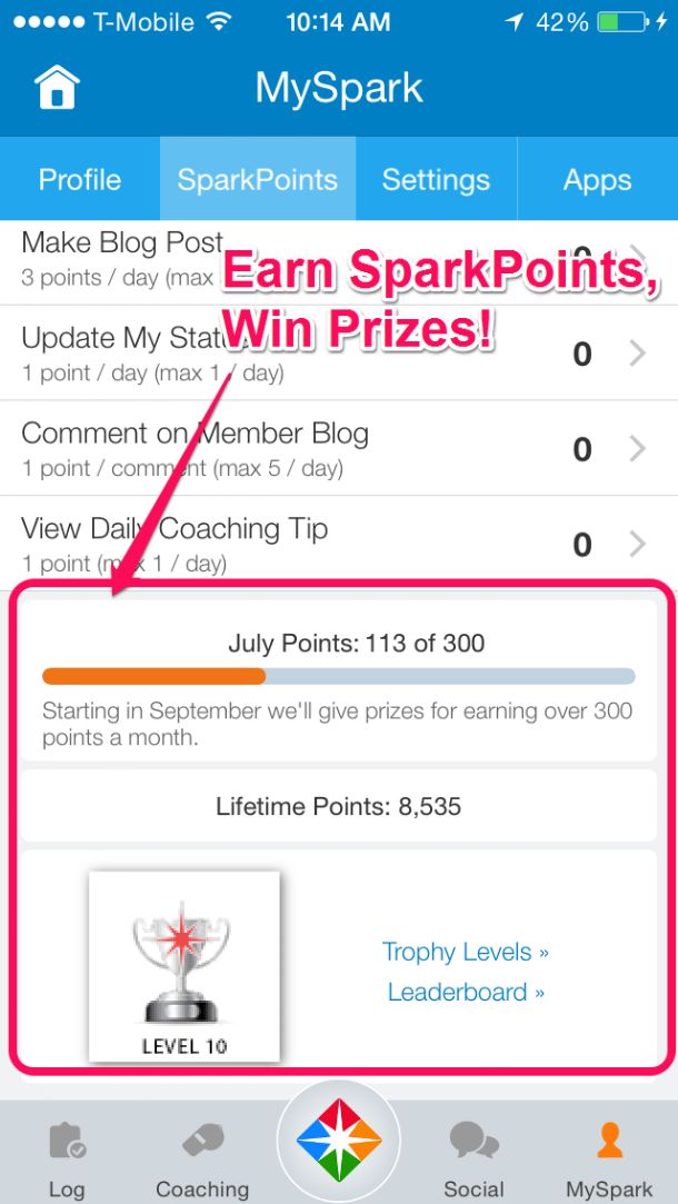
SparkPoints have a much stronger place in the app (WooHoo!). We really went all in on SparkPoints, making it easier to get SparkPoints from the app and giving you more details on how to earn points. We did this because sometime in the next few months, we’re going to start giving out prizes to members who earn more than 300 SparkPoints per month.
 Stay tuned for the kickoff announcement coming to this blog later this year - it’s going to be awesome!!
 Things We Took Out
While redesigning the app, we realized we couldn’t keep everything in it. We wanted to make the app load as fast as possible and ensure the navigation was more intuitive and easier to use. While we were able to keep almost all of the features in the app (and add a few new ones, too), there were some features we took out. So you don’t waste time looking for them, we thought it would be more helpful to list them here:
-
Quick Track: We got rid of the Quick Track option because it’s even easier to track your nutrition and fitness with our simplified navigation.
-
Goal Board: The Goal Board function wasn’t used much in the app, so we took it out. But don’t worry: if you love your Goal Board, you can still find it on the Start page at SparkPeople.com.
-
GPS: As we’ve rolled out more integrations with other apps like Runkeeper, more of our members have been using those apps to track walks and runs and then feeding that information over to their SparkPeople accounts. Instead of trying to keep GPS in our app, we encourage you to try one of our partner apps--they’re great!
-
Reports: The nutrition report is the most-used report in our app, so we improved it (click on the “Full Nutrition Report” button on the Log screen to see it) and removed the rest of the reports. But never fear--you can still access more detailed versions of other reports on our desktop site.
-
Customizable Home Screen: We eliminated the ability to customize the home screen of the app. Most of our members didn’t use this and it caused the home screen to load more slowly.
We’re very excited to bring you this newest version of SparkPeople Mobile. If you like the app, give us a great review in the app store--every positive review we get from our members helps us spark even more people to live healthier and happier lives. Or if you’re not the app-review type, feel free to tell your friends about it!
UPDATE 8/17/15
After releasing the newest version of SparkPeople Mobile, you provided feedback about some features you missed and some bugs we missed. We pushed out a mini-release to our app to address some of these issues; the Android update went out last week and the iOS update went out today. Some of the changes we made in this small version release include:
- We increased the font size throughout the app, making the words easier to read on your phone.
- We added the Calorie Differential Report back into the app. You can now find this report by going to the "Log" screen and scrolling to the bottom. There, you will find a button that says "Full Nutrition Report." Click on the button, and you will find another button that will take you to the Calorie Differential Report.
- We added the ability to change the dates on your weight entry screen, giving you the option to enter your weight for previous days.
- We enabled the ability to view comments on your own profile, a feature that you can access from the "Social" tab.
- We fixed a small bug that was causing issues if you were trying to manually enter a strength exercise.
Thank you so much for using our app, and thank you for letting us know ways in which we can make the app better for you. If you have any questions, suggestions or concerns, please email us at support@sparkpeople.com!
.png)
 Stay tuned for the kickoff announcement coming to this blog later this year - it’s going to be awesome!!
.png)


